In today’s digital landscape, it’s easy to assume that a stunning website filled with impressive animations and intricate designs is the key to capturing your audience’s attention. However, this isn’t always the case. In fact, overly designed websites can often decrease sales and hinder performance. This article explores why simpler, more straightforward websites tend to convert better and how you can optimize your site for maximum impact.
The Misconception of Beautiful Website Design
While a visually appealing website can create a strong first impression, it’s not the sole factor in driving conversions. Companies like Apple can afford to have elaborate designs because their brand recognition is so strong that visitors already know what they want. For most businesses, however, the primary goal of a website is to communicate value quickly and encourage visitors to take action.

The Importance of Clarity and Focus
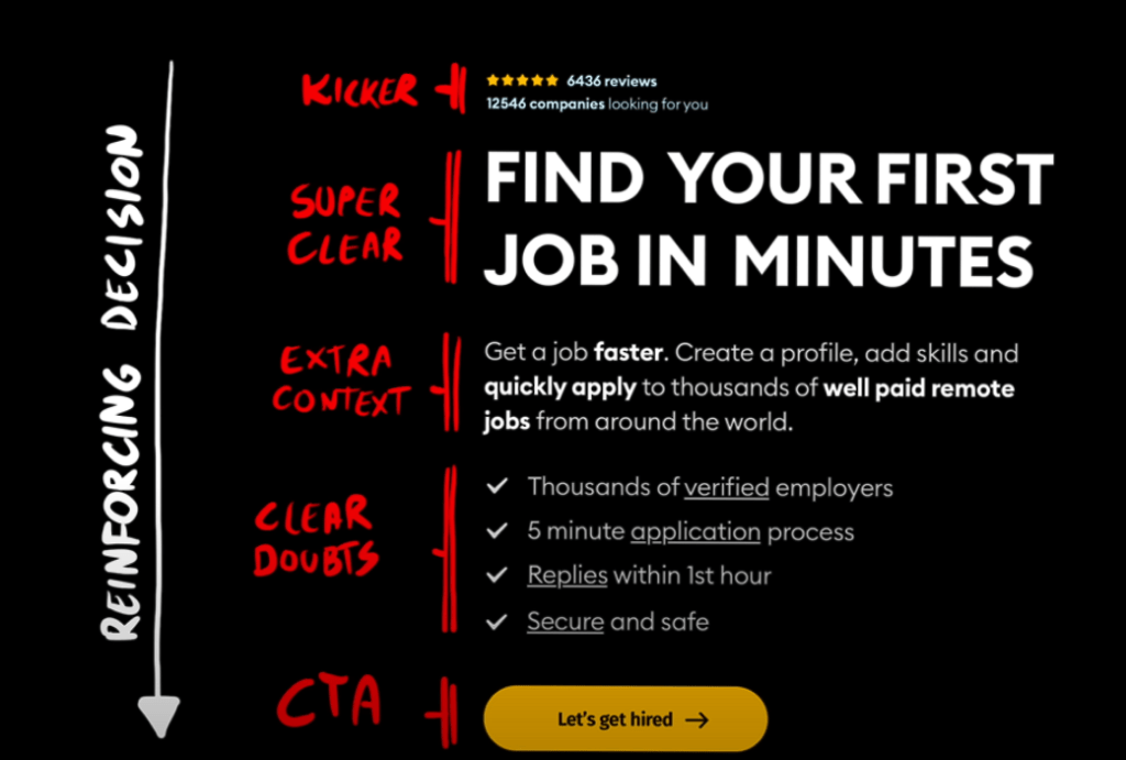
According to a study by Microsoft, the average human attention span is now just 8 seconds1. This means you have a very short window to capture your visitor’s interest. Clear and concise messaging is crucial. Your website should immediately convey:
- What your product or service is
- How it solves the visitor’s problem
- Why it’s better than the competition
Using straightforward language and avoiding jargon can help visitors understand your value proposition quickly.

The Role of Social Proof
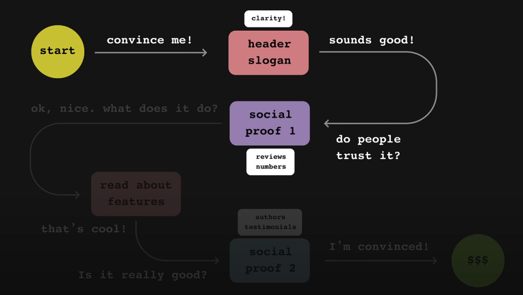
Social proof is a powerful tool in building trust and credibility. Incorporate elements such as:
- Testimonials and Reviews: Display positive feedback from satisfied customers.
- Awards and Recognitions: Showcase any accolades your business has received.
- Usage Statistics: Highlight the number of customers served or products sold.
For example, mentioning that “Over 10,000 satisfied customers have improved their productivity with our software” can significantly boost confidence in your offering.
Cognitive Overload and User Experience
Websites overloaded with animations, flashing graphics, and complex layouts can overwhelm visitors. Cognitive overload occurs when the brain receives more information than it can process, leading to frustration and abandonment. A study by Google found that visually complex websites are rated as less beautiful than simpler ones within 17 milliseconds of viewing2.
Tips to Avoid Cognitive Overload:
- Limit Animations: Use animations sparingly and only when they serve a purpose.
- Simplify Navigation: Make it easy for visitors to find what they’re looking for.
- Use White Space: Allow your content to breathe to enhance readability.
Loading Times and Their Impact on Conversions
Website loading speed is a critical factor in user experience. According to Google, 53% of mobile users abandon sites that take longer than 3 seconds to load3. Slow loading times not only frustrate users but also negatively impact your search engine rankings.
How to Improve Loading Times:
- Optimize Images: Compress images without losing quality.
- Minimize Code: Reduce unnecessary code in your CSS and JavaScript files.
- Use a Content Delivery Network (CDN): Distribute your content across multiple servers worldwide.
CTA Button Best Practices
Your Call-to-Action (CTA) button is the gateway to conversions. Designing it effectively can significantly impact your click-through rates.
Best Practices:
- Unique Color: Use a color that stands out from the rest of your site’s palette.
- Clear Text: Use actionable language like “Get Started” or “Sign Up Now.”
- Visibility: Place it prominently where users can easily find it without scrolling.
Aesthetic Usability Effect
While simplicity is key, aesthetics still play a role. The Aesthetic Usability Effect suggests that users perceive attractive products as easier to use. Balancing simplicity with a clean, professional design can enhance user satisfaction.
Balancing Act:
- Consistent Typography: Use fonts that are easy to read and consistent throughout.
- High-Quality Images: Use relevant images that enhance your message.
- Color Harmony: Choose a color scheme that aligns with your brand and is pleasing to the eye.
Tailor Your Message to Your Audience
Understanding your target audience is essential. Different audiences have different needs and expectations.
- For B2B Clients: Detailed information and case studies may be necessary.
- For General Consumers: Simplicity and ease of use take priority.
For instance, a medical software company targeting hospital directors may require a more comprehensive website with detailed subpages and technical information.

Testing and Optimization
Continuous testing is vital for optimizing your website’s performance.
Strategies:
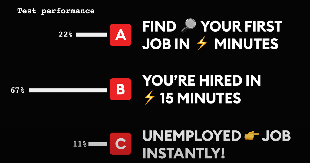
- A/B Testing: Compare two versions of a webpage to see which performs better.
- Analytics Monitoring: Use tools like Google Analytics to track user behavior.
- User Feedback: Collect feedback to identify pain points and areas for improvement.
Regularly updating and tweaking your site based on data can lead to significant improvements in conversion rates.
In the quest for higher conversions, simplicity often triumphs over complexity. By focusing on clear messaging, reducing cognitive overload, optimizing loading times, and understanding your audience, you can create a website that not only looks good but also performs exceptionally well.
References:
Microsoft. (2015). Attention Spans.
Google Research. (2012). The Role of Visual Complexity and Prototypicality Regarding First Impression of Websites: Working Towards Understanding Aesthetic Judgments. Link
Google/SOASTA Research. (2017). The State of Online Retail Performance. Link