A light build, deliberately
Hello Elementor rather than a theme with a demo site inside it. Nothing ships that the page does not draw.
Website and AI chatbot case study
A landing page for a DIY car-repair app, and an assistant on it that answers the question instead of collecting an email address and promising to come back tomorrow.
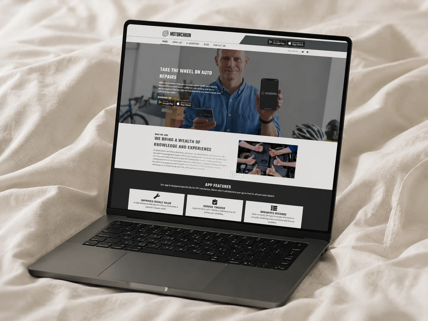
Motorchron is an app for people who service their own cars: a running log of every repair, part and receipt, so the history exists when something goes wrong or the car goes up for sale. What it did not have was anywhere to send the people who had heard about it.
This is that page. One screen that makes the case, shows what the app tracks, and puts it on both stores — built on WordPress and Elementor so the team can change it without booking a developer, and kept deliberately light underneath.
The part that is not a landing page is the assistant. It answers questions about repairs and about the app itself, in the place where somebody would otherwise have opened a support ticket and waited.
A walkthrough of the Motorchron site and the assistant that sits on it.
One page that does the whole job
What the app is, what it tracks, how people use it and where to download it — one scroll rather than a five-page brochure site.
An assistant that answers repair questions
Trained on the site and the app's own material, so a visitor gets an answer instead of being routed to a contact form.
Editable without a developer
Every section is an Elementor block. Announcing a new feature is an afternoon, not a ticket.
Built to be found
Semantic headings, images sized to the layout and a theme that adds nothing — because a landing page nobody can find is a leaflet.
Motorchron's pitch is not a feature, it is a habit — log the work, keep the receipts, and be the person with a documented service history when the car is sold or the mechanic is wrong. That is easy to explain to somebody who already spends Saturdays under a bonnet and hard to explain to somebody scrolling an app store. The page had to make the case in one scroll, on a phone, before the download button; and then it had to keep answering the questions the page itself had not anticipated.
The questions arrive out of hours
People researching a maintenance app are doing it at the weekend, in a garage — not between nine and five.
The value is in the detail
Resale value, service tracking, VIN history: each needs a sentence, and six sentences in a row is a wall nobody reads.
A contact form is where interest goes to die
Somebody with one question about whether the app suits their car will not fill in a form and wait a day to find out.
The build is boring on purpose. WordPress and Elementor on a bare theme, no bundled demo content, no plugin doing work that CSS already does — which is what keeps it quick on a phone in a garage with two bars of signal. On top of it sits an assistant whose knowledge is the app's own material, so the questions the page did not answer get answered anyway, at eleven at night, with nobody on our side awake.
Hello Elementor rather than a theme with a demo site inside it. Nothing ships that the page does not draw.
Its knowledge base is the site's own copy, so it explains Motorchron in Motorchron's words rather than improvising a plausible answer.
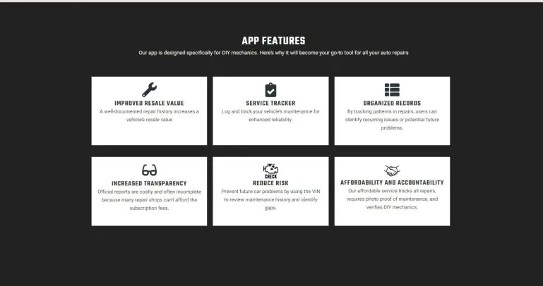
The feature grid is the entire pitch, scannable in about ten seconds. It is what most visitors read instead of the paragraphs.
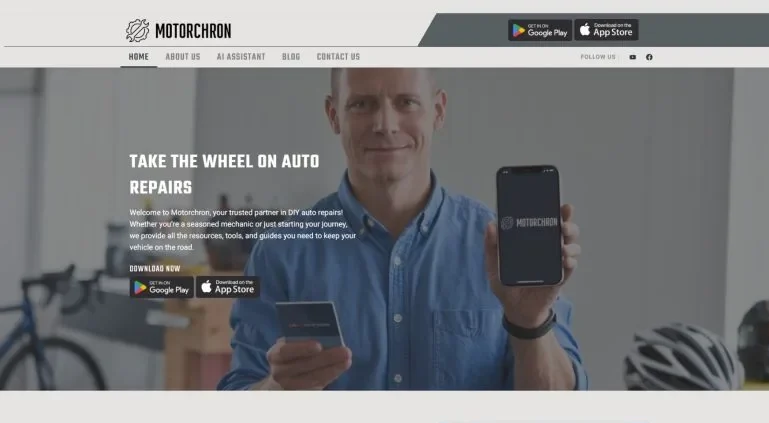
One line, one photograph and both store badges. The claim is a promise rather than a feature list, because at this point in the scroll nobody has agreed that they have a problem yet.
Resale value, service tracking, organised records, transparency, risk and cost — one card and one sentence each. It is the section visitors actually read, so it carries the argument the hero only opens.
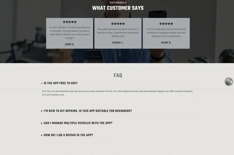
Reviews from people already using the app, then the four questions everybody asks, answered on the page. Anything not on that list goes to the assistant rather than into a contact form.
Solution: Elementor's convenience is other people's markup, and a stock theme quietly adds a second copy of everything. Building on Hello Elementor — a theme that is close to nothing — means the CSS and JavaScript on the page is the CSS and JavaScript this page uses.
Solution: A general assistant answers car questions confidently and Motorchron questions vaguely. Its knowledge base is the site's own copy and the app's material, so product questions get the product's answer and everything else is handled as general advice rather than invented detail.
Solution: Images are sized to the layout instead of uploaded at whatever the camera produced, and there is no hero video. The audience for this page is frequently standing next to a car rather than a router.
Jh Akash was a pleasure to work with on our website development project. His professionalism shone through in the quality of his work, and he consistently delivered on time while maintaining proactive communication. Highly recommend! 👍
Motorchron
Client, via Fiverr
Let's build the page that sells it.